Project Brief
The county of Clearwater is home to some of the most beautiful scenery Alberta has to offer.
They came to us needing help to improve and clarify their brand standards to make it easier for staff, vendors, and the community to utilize their logo and branding appropriately.
Their existing brand standards document was an old-school PDF that wasn’t as specific as it needed to be and lacked the guidelines required to ensure their brand was consistently executed in all applications. The PDF also lived on their network drive, making it difficult to update over time and ensuring everyone (especially those outside the organization) always had access to the latest version.
Our Solution
We met with the communications team at Clearwater County to determine the exact pain points and most common inconsistencies they see when reviewing materials created by other departments and outside parties.
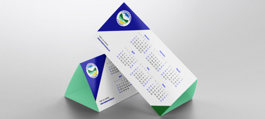
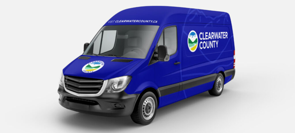
Next, we put together a plan to address each concern, drafted a much more comprehensive set of brand guidelines, and mocked-up various assets to demonstrate the new standards in action.
Everything came together in a new digital brand standards format that scraps the PDF in favour of an online version. This can be updated at any time, accessed through their website, and includes downloads of their logo files and branded assets.
During the process, our design team identified a few subtle tweaks we could make to their existing logo and also introduced a horizontal version that they never had before.
Updating The Logo
The County was happy with its branding, but it came with some frustrations, especially when using the logo in small applications like embroidery or on social media. This was not a situation where we needed to start from scratch and after an audit of their existing brand and marketing materials, it was clear that we need to maintain the overall shape and design of the logo. Our goal was to refine what they already had by simplifying the design and improving the legibility of the text.
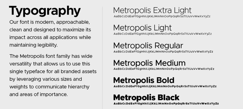
We implemented a new, easy-to-read font, adjusted spacing, removed the double outline, and made minor refinements to the elements within the badge.
The changes were subtle, but the results are quite bold!


Digital Brand Standards
Creating more detailed brand guidelines and compiling them into a 25-page PDF is not the way to ensure those guidelines will actually be followed and understood. As a brand evolves over time, you’ll also want to update the brand standards to reflect the most current version of your visual identity.
Don’t have a standard for how your logo should look in VR? Maybe you’ll add that one day. Have you seen your logo used in a visually-horrendous way that you could have never anticipated? Let’s update the “what not to do” section with the example. Or you may find a new way to use your brand on social media that looks stunning and gets a lot of engagement. Just add that to your brand standards so it can be easily replicated in future marketing.
Making Clearwater County’s brand standards available online ensures that all parties (staff, vendors, and the community) have access to the latest versions of their logo, colours, fonts, and the guidelines to use them correctly.
